Project Overview
I along with four other team members took on the challenge of reorganizing a non-profit organization's website information architecture.
The Problem:
We believe reorganizing the website’s information architecture will improve the user’s experience. We have observed that the Butterfly Village Inc website doesn’t have a strong information architecture causing users not to reach the information that they are seeking. Our main focus is on the issue of micro-interactions, visualization, and the signup process for the programs. On their current website, they do not have a sign-up process for their programs.
The Solution:
Our team believes redesigning the information architecture of the site will make information more readily accessible for users.
My Role:
User-Persona | UX Storyboarding | UI Style Guide | UI Style Design Inspiration | Lo-Fi Sketch | Mid - HiFi Digital Clickable Prototype | Hi-Fi A/B Variations | Complete User Testing Plan
Tools:
Figma, Miro, Google Drive (Docs, Slides, Sheets) Invision, Slack, Zoom
Research
Empathize & Define
Empathize - Heuristic Eval.
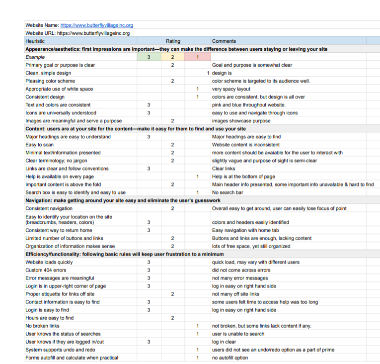
Part of the team’s research included stakeholder interviews, user interviews, creating a proto-persona, and conducting a heuristic evaluation that measures the usability of the organization’s website.
Define.
At this stage, the team and I gathered the artifacts from our research methods to define the goals and objectives for the user experience. As we push forward in this stage, I was tasked with contributing to the team’s affinity diagram.
Having all the key components from a well thought out research plan, we were able to produce a problem statement:
“We believe reorganizing the website’s information architecture will improve the user experience. We have observed that the Butterfly Village Inc website doesn’t have a strong information architect causing users not to reach the information that they are seeking. Our main focus is on the issue of micro-interactions, visualization, and the signup process for the programs. On their current website, they do not have a sign-up process for their programs.”
User Insight
Mia Brown, a high school student, needs access to content related to STEM to keep her inspired to constantly push herself towards a career in STEM.
During the research, we discovered that the homepage has very little information in its corresponding tabs and it lacks visuals about their non-profit.
Therefore, we believe that showing visuals and displaying the non-profit’s information will gain interest from young girls in STEM and that we might be able to help if we add more interactive visuals and change the information architecture of the website.
How Might We Statement: How might we create a more organize information architecture to support our potential users in successfully finding the information that they are seeking?
Ideate
Ideate (Card Sorting)
In this phase, we begin the ideation process by card sorting. We used the card sorting method to build the information architecture of a system. The team accomplishes this by grouping individual labels written on virtual notecards (Miro) according to criteria that make sense. The result is an information architecture system that matches the expectation of the user.
Ideate (Site Map)
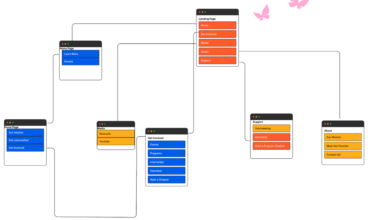
As my team completed the user flow diagram and the site map for our new architecture redesign, I was tasked with fleshing out a prototype that follows the course of the map.
Prototype.
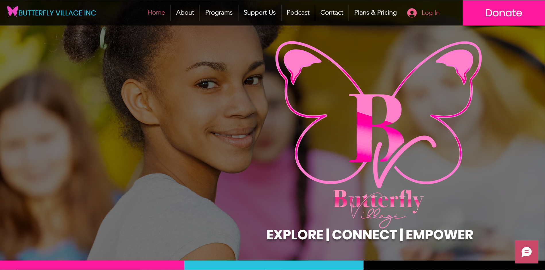
The OG (Original).
This is the original website design of the organization, Butterfly Village Inc. This website was critiqued by its users while our team applied heuristic evaluation to measure its usability.
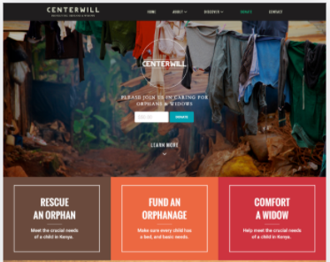
The Inspiration.
Centerwell website was used as my design inspiration. The minimum structure of its landing page lightens the cognitive load of its visitors, still maintaining the ability to display its valuable components while providing the user with easy-to-follow navigation.
The Product.
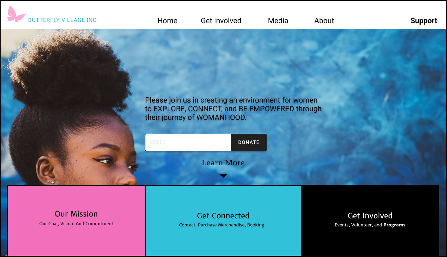
Marrying the OG and The Inspiration together, I was able to flesh out this final design that was tried and testing by multiple users, iterations made based on the results of the test. Here you see the final product with a minimum yet high-quality design. We use recognizable and concise language to provide humanized guidance throughout the website.
Hi-FI Digital Prototype.
Witness the user as she navigates through the website seamlessly to register for her first program with ButterFly Village Inc.
Next Step.
Apply redesign throughout the rest of the website such as the media and about tabs. We want to be able to include micro-interactions throughout the entirety of the website’s interface.
